Oct. 16, 2026
A US importer of children’s party supplies wanted to add something different to its birthday candle range. The company already supplied balloons, table covers, party tableware, and party hats to local gift stores, children’s boutiques, and online sellers. But its candle selection relied mainly on standard designs from existing suppliers.
The customer saw an opportunity in the 6–8 age group. Children at this age are developing stronger preferences: some no longer want designs that feel too babyish, yet they still enjoy characters and imaginative themes. Parents, meanwhile, look for products that feel thoughtful, suit a birthday celebration, and come with clear safety information.
The brief sounded simple—create a distinctive themed birthday candle—but the details were not. The design needed a story without looking overly cartoonish, appeal to both boys and girls, and feel special to children while remaining acceptable to parents.
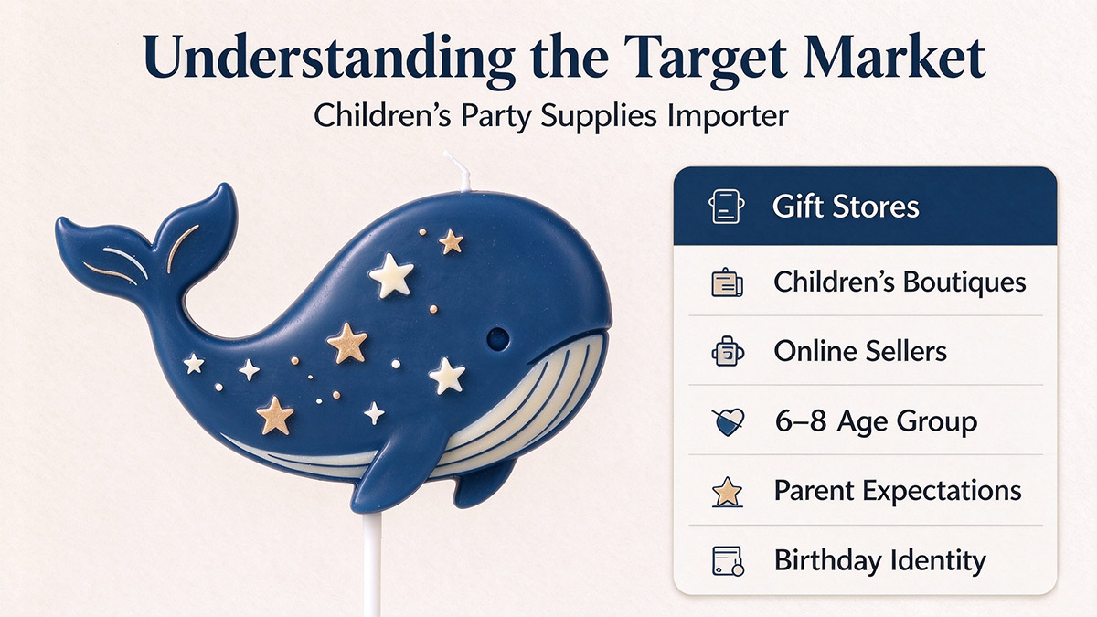
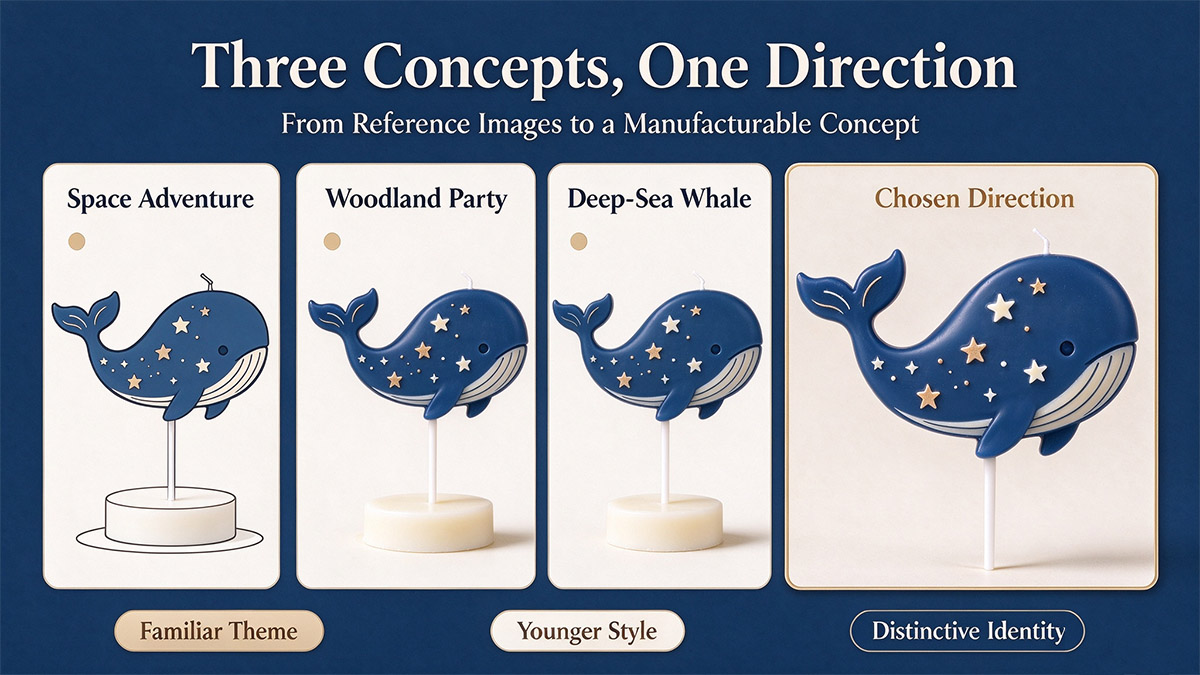
The customer shared reference images featuring space, woodland animals, and a deep-blue night sky. Rather than copying one reference, our development team proposed three possible directions.
Space Adventure used rockets, planets, and astronauts. It offered plenty of room for playful details, but similar products were already common.
Woodland Party featured small animals, tree houses, and mushrooms. Its natural colors felt gentle and welcoming, although the overall style risked skewing younger than the target age.
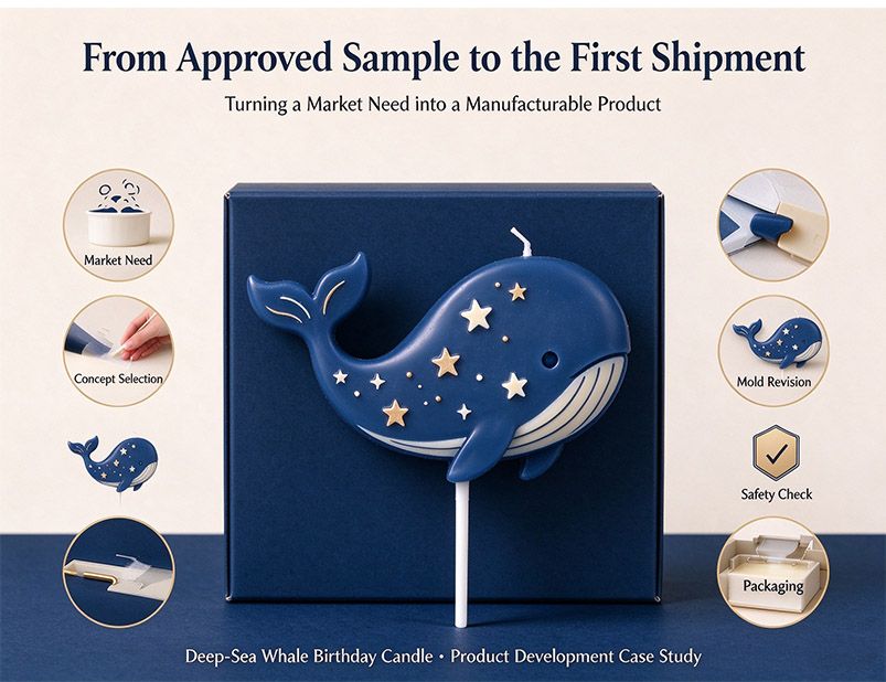
Deep-Sea Whale combined a whale, stars, and a suggestion of the sea. It felt quieter and more imaginative, with a visual identity that could stand apart from more familiar character candles.
The customer chose the whale concept. One comment helped guide the next stage: the whale should not look as if it were trapped. That meant the shape and surrounding details had to suggest movement and open water, rather than simply placing an animal figure on a cake.
The first sample established the general shape and deep-blue color. But the customer felt that the stars did not create the atmosphere shown in the reference image: “It doesn't look like it would glow.”
This was a comment about the visual impression, not a request for a candle that produced light by itself. On screen, the original creamy-white stars looked soft. On the physical sample, however, the contrast was too weak, and the details did not stand out as intended.
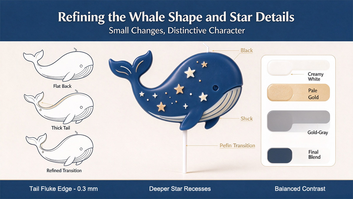
The star color went through four versions. Creamy white was too subtle. Pale gold improved contrast but looked too metallic. A less saturated gold-gray version appeared dull. The final blend used creamy white with very small amounts of pale gold and light blue, creating a softer, more balanced effect without making the stars look harsh.
The whale’s shape also needed work. The back looked too flat, the tail fluke appeared thick, and the edge lacked definition. The mold was revised three times. The first revision still looked too much like a toy whale. The second improved the curve of the back but left a thick connection near the tail, which caused marks during demolding. The third refined the transition from the back to the tail and reduced the tail-fluke edge by 0.3 millimeters. The star recesses were also deepened to make the details clearer.
These were small changes, but together they affected whether the candle felt considered and distinctive rather than generic.
The initial design placed the wick in a small sea-like base beside the whale. During review, the team had to balance two competing needs: a base that was large enough to remain stable as the candle burned, but not so large that it overwhelmed the design.
The original base felt too small for the intended use. Making it much larger, however, made the overall shape look heavy. The team changed it to a teardrop form, suggesting water pushed aside by the whale while giving the composition a more integrated appearance.
The wick was also changed to a finer cotton wick to achieve the intended flame size and appearance. The final configuration was evaluated as part of the project’s burning-performance checks. As with any birthday candle, the product is intended for use with adult supervision and should be kept away from children when lit.
Visual approval was only one part of the development process. For this US-market project, the required documentation and checks included the applicable Children’s Product Certificate (CPC) work, ASTM F2417 burning testing, and ASTM F2058 warning-label requirements. The customer and manufacturer coordinated the relevant material information, test records, and label review before moving forward.
Packaging needed the same practical attention as the candle itself. The first molded-pulp insert held the whale securely, but the tail area was too tight. Removing the candle from the box could risk disturbing the star details.
A small relief cut was added around the tail. This helped the insert hold the product during transport while making removal easier. The packaging used a recyclable paper box and molded-pulp insert to reduce reliance on plastic. Inside the lid, the customer approved a short message: “You are never alone.”
That line suited the theme without turning the packaging into a long explanation of the design.
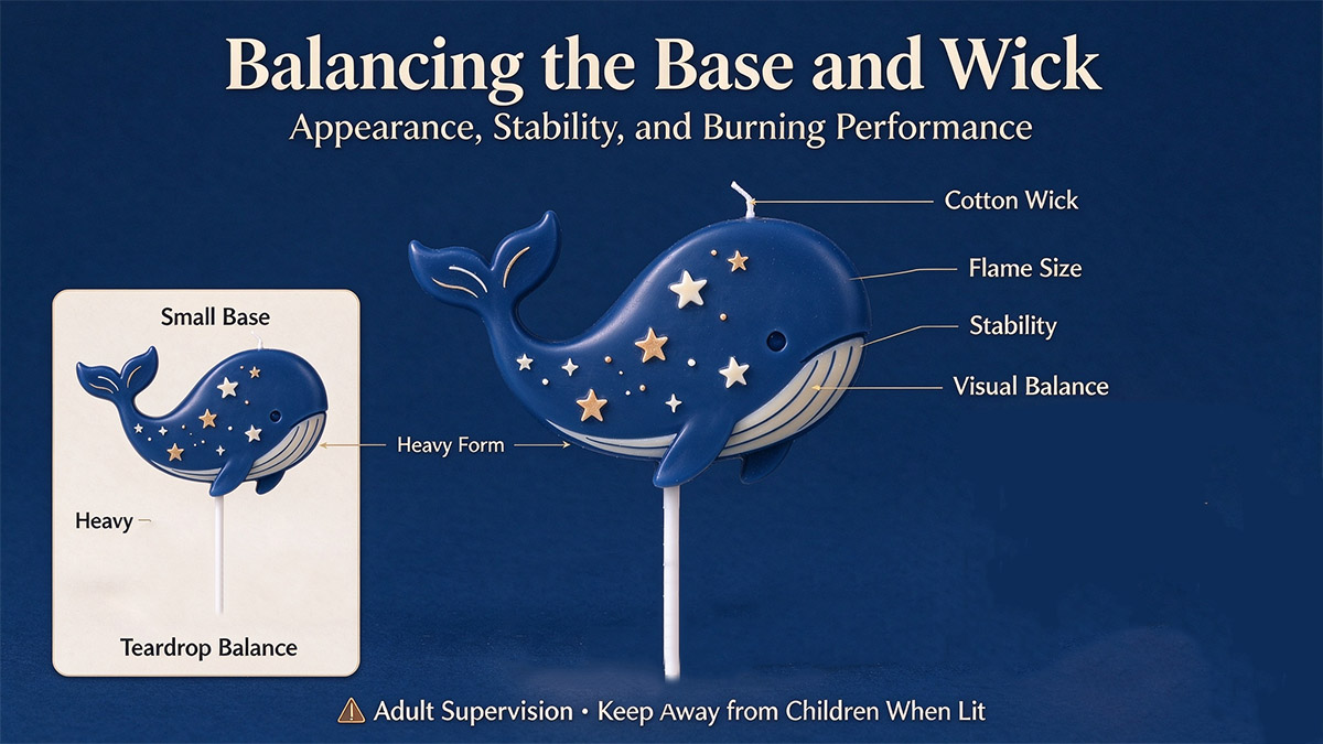
Before mass production, the customer reviewed and approved the final shape, star color, wick position, and packaging structure in a pre-production sample. The range was prepared in two formats: a single-candle pack and a two-candle pack.
The first order was then produced and shipped. The customer confirmed that the finished appearance, packaging, and burning performance matched the approved sample. After the initial project, the customer also asked about developing two complementary designs—stars and a lighthouse on the sea surface—to extend the visual theme.
That follow-up request mattered because it showed that the concept could work as more than a single novelty item. It had the potential to become a small, connected collection.
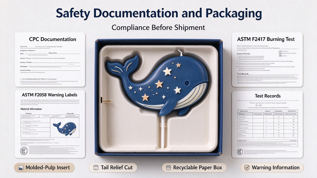
The deep-sea whale candle did not come together through one dramatic design decision. It developed through a sequence of practical choices: understanding the target age group, comparing concepts, adjusting color and mold details, reviewing wick and base performance, completing the relevant safety work, and improving the packaging.
The project also showed why a reference image is only a starting point. Colors can look different on screen and in wax, small mold details can affect the finished character, and packaging can protect a product while still making it difficult to remove.
For the customer, the result was a themed birthday candle shaped around a specific market need. For the development team, the most useful outcome was a clearer design direction—and a foundation for the next products in the series.
 Big size decorative scented candle
 Christmas Scented Candles Gifts Sets for Women
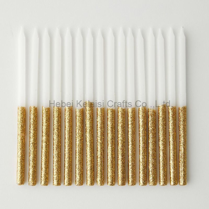 happy birthday long thin glitter cake candles
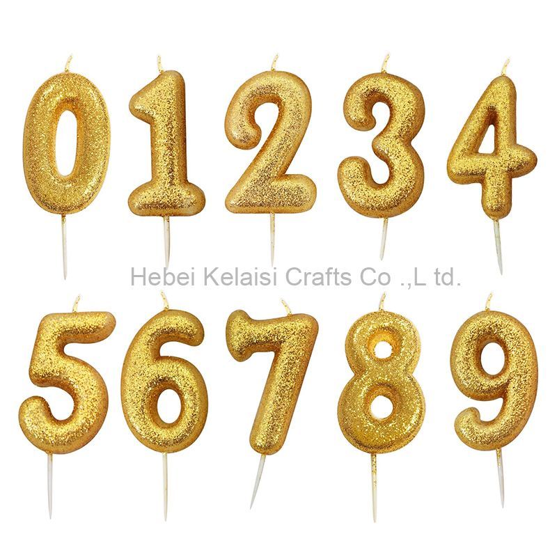 Luxury Golden Birthday Number Candle Sets
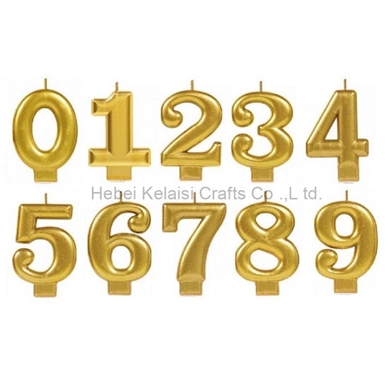 Fancy cake decoration number annual birthday candle
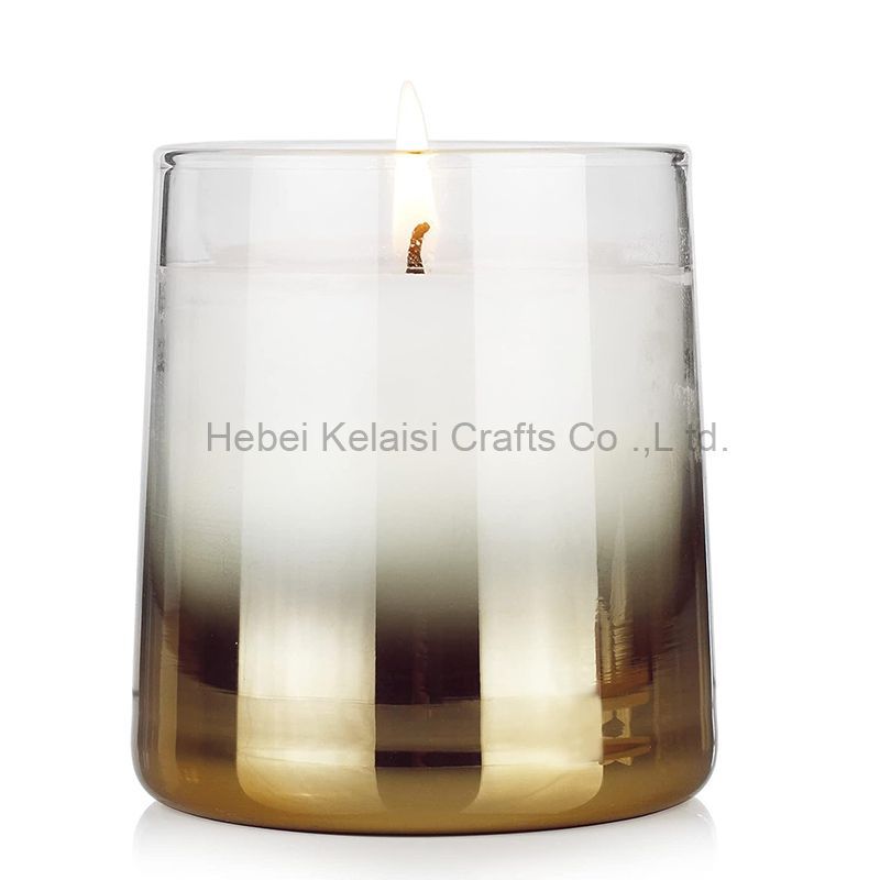 Gradient color Soy Wax Glass Jar Scented Candle
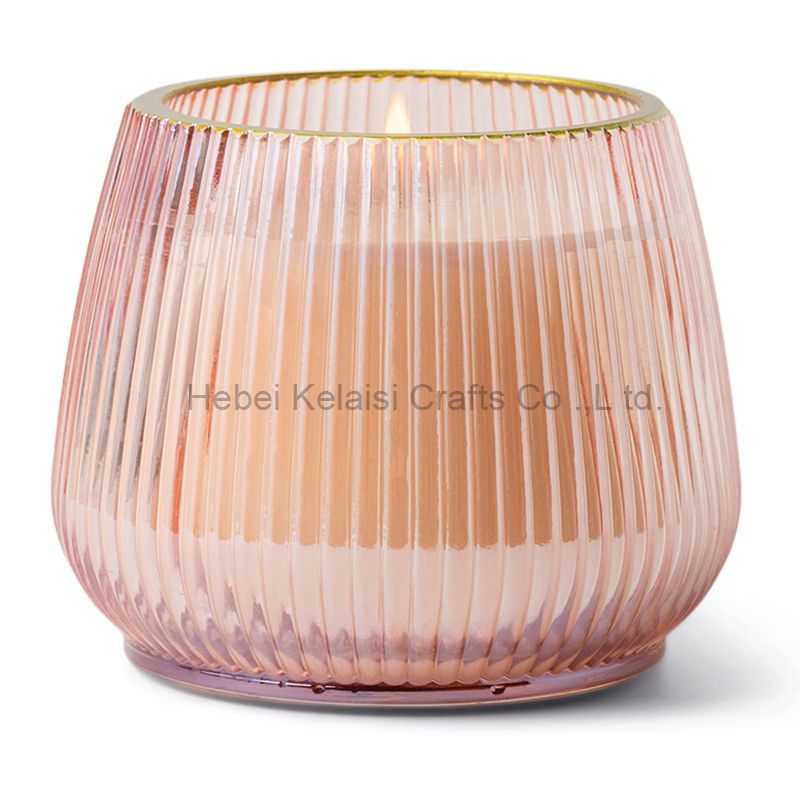 Origami Style Vertical Pattern Wine Glasses Jar Candles
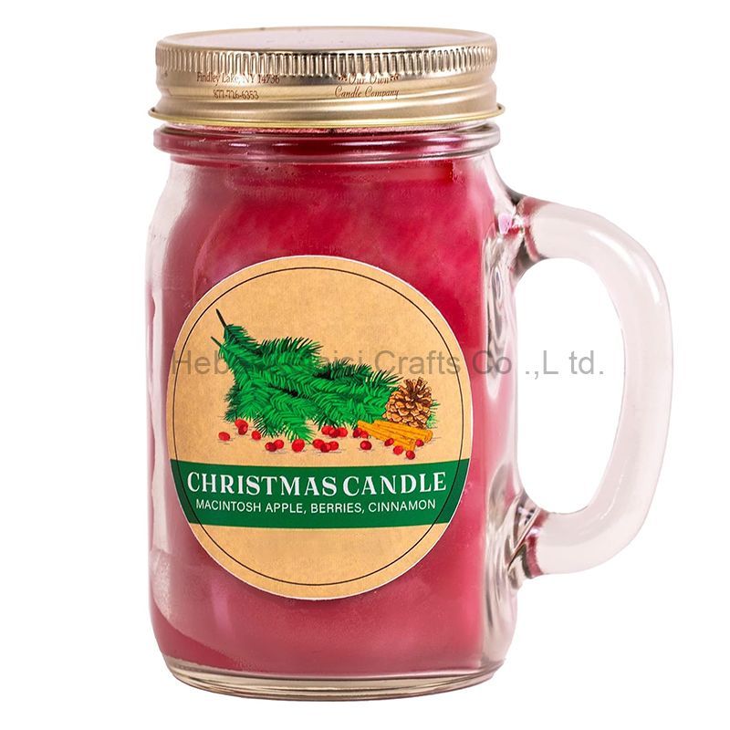 Custom Mini Glass Jar Scented Candle
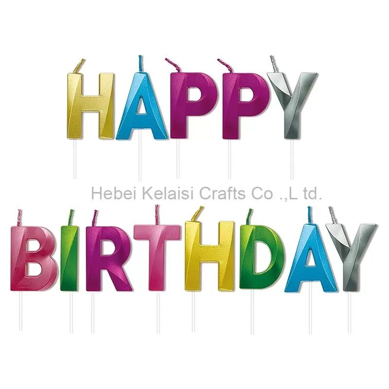 3D Letter Happy Birthday Candles
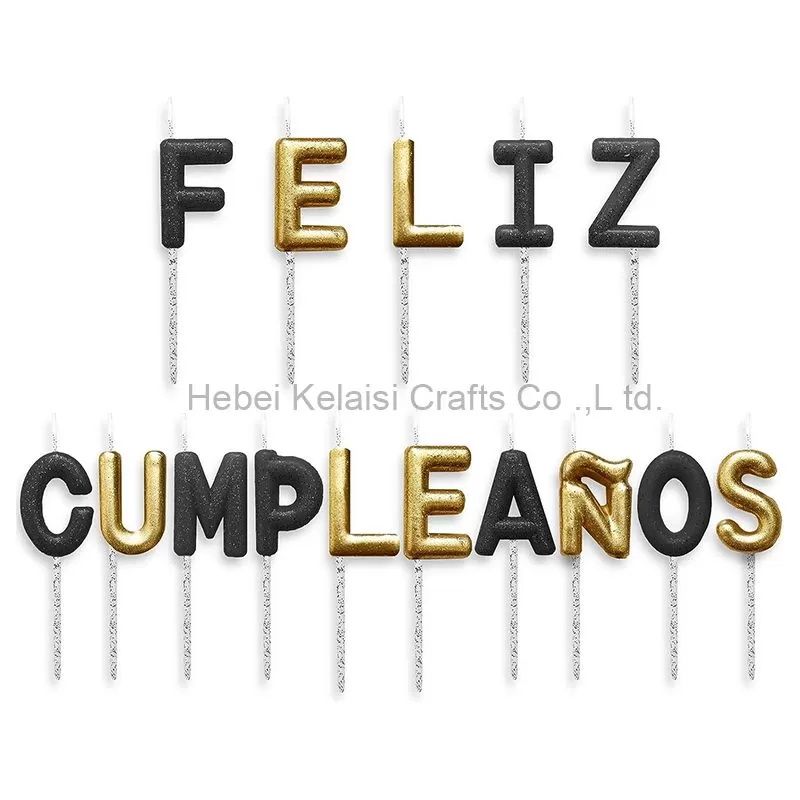 Decorative Birthday Candles
 St. Patrick's Day Decorations Set
 Christmas Party Balloons Supplies